
Canva is a free, browser-based design tool that lets beginners create professional graphics using drag-and-drop templates, a Brand Kit for consistent colors and fonts, Magic Resize to adapt one design across platforms and built-in AI tools like Magic Write and Magic Design. The fastest way to get good at Canva as a beginner is to start from a template, build a Brand Kit first, learn the grid and text-hierarchy tools and practice resizing one design for five different platforms. These same design fundamentals form the backbone of most modern Graphic Designing Course in Thiruvananthapuram and Digital Marketing Course in Thiruvananthapuram curriculums, because visual content now drives the majority of engagement across social media and ad platforms.
10 Canva Tips and Tricks Every Beginner Should Know
1. Start From a Template, Not a Blank Canvas
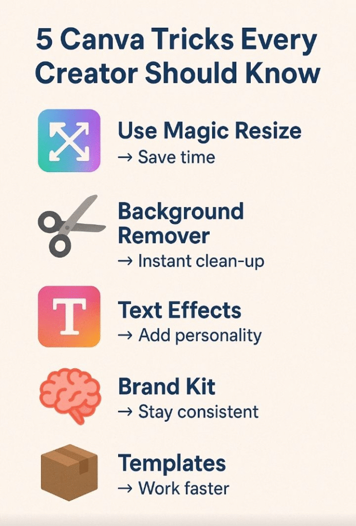
Beginners waste hours staring at an empty page. Instead, search Canva’s template library by platform (Instagram Post, YouTube Thumbnail, Resume, Presentation) and customize colors, fonts and images. This alone cuts design time by more than half.
2. Build Your Brand Kit First
Before designing anything else, set up your Brand Kit (Canva Pro) or manually save your brand colors, logo and fonts. This keeps every future design consistent a core principle taught in almost every professional Graphic Designing Course in Thiruvananthapuram, where brand consistency is treated as a ranking factor for client trust.
3. Master Magic Resize
Design once, resize everywhere. Magic Resize instantly adapts a single design into Instagram, Facebook, LinkedIn and YouTube dimensions a massive time-saver for anyone managing multiple social accounts.
4. Use the Background Remover
One click removes the background from any photo. This is especially useful for product photography, team headshots and testimonial graphics no Photoshop needed.
5. Learn Basic Text Hierarchy
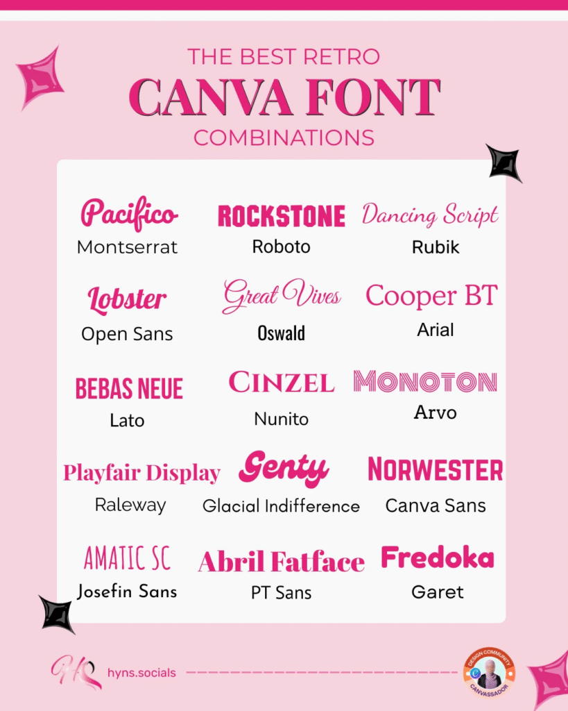
Use no more than 2–3 font styles per design: one for headlines, one for subheadings, one for body text. Contrast in size and weight guides the viewer’s eye a fundamental principle covered in beginner design and UX modules across most Digital Marketing Institute for Beginners in Kerala programs.
6. Use Grids and Frames for Photo Layouts
Grids let you snap multiple images into clean, aligned layouts without manual resizing ideal for before/after posts, product carousels and testimonial collages.
7. Explore Canva’s Element and Icon Library
Millions of free icons, illustrations and shapes are searchable directly inside the editor. Use them to break up text-heavy designs and add visual interest without needing external design software.
8. Try Canva’s AI Tools: Magic Write and Magic Design
Magic Write generates on-brand captions and headline copy in seconds. Magic Design turns a single prompt or uploaded photo into multiple ready-to-edit layouts. These AI-assisted workflows are exactly why AI literacy is now bundled into most AI Course in Thiruvananthapuram offerings alongside traditional design training.
9. Use Folders and Team Collaboration
Organize projects into folders and invite teammates to comment or co-edit in real time useful for agencies, student teams and small businesses managing multiple clients or campaigns at once.
10. Download in the Right Format for the Platform
Use PNG for transparent backgrounds and web graphics, JPG for photos and smaller file sizes and PDF for print or portfolio-ready presentations. Choosing the wrong format is one of the most common beginner mistakes.
Keep it consistent
With so many incredible fonts on offer, it can be tempting to mix and match with every new creation. And, of course, you should experiment to your heart’s content! But to really take your design to the next level, it’s important to keep your fonts and colors consistent.“Find two main fonts that you use that are separate to your logo,” says branding strategist and designer. “Be faithful to them and your brand will thank you in the long run.”
But how do you go about finding your if you don’t already have professional branding? Apart from searching for ones that capture the essence of you and your brand, Kira says the key is to go for (one for your main headings and one for your body text) that While Kira recommends avoiding multiple cursive fonts (that is, fonts that look like handwriting), you’re probably not going to want to combine a bold, blocky font with one that is thin and feminine. Here, you can see an example of two different fonts that perfectly balance each other out.
Choose the right dimensions for your design
Add your elements
Your design might include text, icons, photos, or illustrations. These need to be combined in a way that is visually appealing.
Canva graphic designer Lynneal Santos says it’s a matter of balance. “Consider the balance and composition of all the elements in the design. When you’re laying out your elements, ask are the elements balanced? Are they centered? And ensure they’re not too close to other elements or the edge of the page.”
Her number one tip? “Keep it simple.” Don’t overload your design with too many elements, as it can confuse the visual message of the image. This is something designers call, which involves the arrangement of elements according to their importance. Try playing with size, color, and placement in order to see what works best.
If you want to add a photo to your design, try using one of Canva’s frames. You can find these under “elements” in the side panel.
Design Tip: Harness the power of negative space. Negative space, also known as white space can be any area within a design that is free from text, images, or embellishments (it doesn’t have to actually be white). Designers love it because it can help create grouping, add emphasis and improve legibility.
Create Clean, crisp and clear imagery
Pump up contrast by adjusting the brightness of the background image so that it offsets the text color, making the design clear and easy to read. This is a great way to apply white or black text over image to create a strong ‘cut-out’ effect.
To begin, choose your design type from the Canva homepage. These are set to the optimal dimensions for each graphic, whether it’s a social media post, or more. Or you can use custom dimensions by searching for “custom size”. You can choose from pixels, millimetres or inches.
Ensure your text is readable
Now that your text is neatly formatted and error-free, it’s crucial to make sure your audience can actually read it. If you’re using a photo as your background (rather than a solid color), this begins with making sure there is blank space in the image where you’ll be able to place your text. Here, you can see an example of where text has been placed in the negative space of the background.
You can see that the use of an open, spacious background within the design not only improves text readability, but also helps make the design look tidy and uncluttered.
To ensure the text in your design is easy to read, it’s generally best to pair light text with a dark background. However, if you find the perfect background and it’s a tad on the light side, there are ways around it. By selecting your background and clicking ‘filter’, you can adjust the brightness of your background.
Here, you can also access a range of filters that can instantly give your background a different feel.